
Appearance
View both effects on the intended surface under the same conditions. Reflection, surrounding print and decorated area size can make foil and metallic ink suit different design goals.
Artwork
Ask how fine details, large coverage and alignment with print will be handled. The artwork preparation and setup should be identified in the quote. Avoid assuming a design can transfer unchanged between methods.
Production
Request a relevant sample or proof and list exactly what it demonstrates. Compare the complete process, material, tooling or setup and order quantity. Choose the option that meets the approved appearance and production brief rather than choosing from the finish name alone.
Related specification support
Compare the effect at normal viewing angles
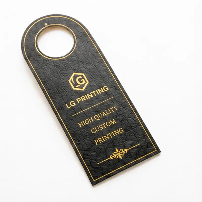
A metallic logo can be produced using different processes with different appearances. Review samples on the intended paper, with the logo at finished size, before deciding which effect best suits the project.
Foil and metallic ink on the actual surface
| Check | What to do | Why it matters |
|---|---|---|
| Appearance | View shine and colour from several angles. | A digital metallic fill does not define the physical result. |
| Artwork | Check linework, gaps and registration. | Fine details depend on the process and substrate. |
| Production | Compare setup and process scope. | Keep quantities and the rest of the specification equal. |
Record the actual product, material or file version used for the comparison. Identify what remains undecided and which sample or document can resolve it.
Discuss metallic effect comparison
Send the product, proposed packaging and finishing specifications, with the file or sample showing the metallic effect to compare.
Foil Stamping vs Metallic Ink FAQ
It may need preparation for the selected method. Identify the intended effect area and have the production file reviewed before treating the processes as interchangeable.
Use the intended paper and a logo at finished size. Review shine and colour from several angles under the same conditions; a digital metallic fill does not define the physical result.
Review fine lines, gaps, large coverage and alignment with print. Compare the quoted artwork preparation, tooling or setup, material and quantity, and record what the sample demonstrates before choosing a process.